The dashboard
Every report, filters that live in the URL, comparison, realtime and the shortcuts.
One screen. No report picker, no menu of saved views to get lost in. Everything is on it, and everything is filterable by clicking.
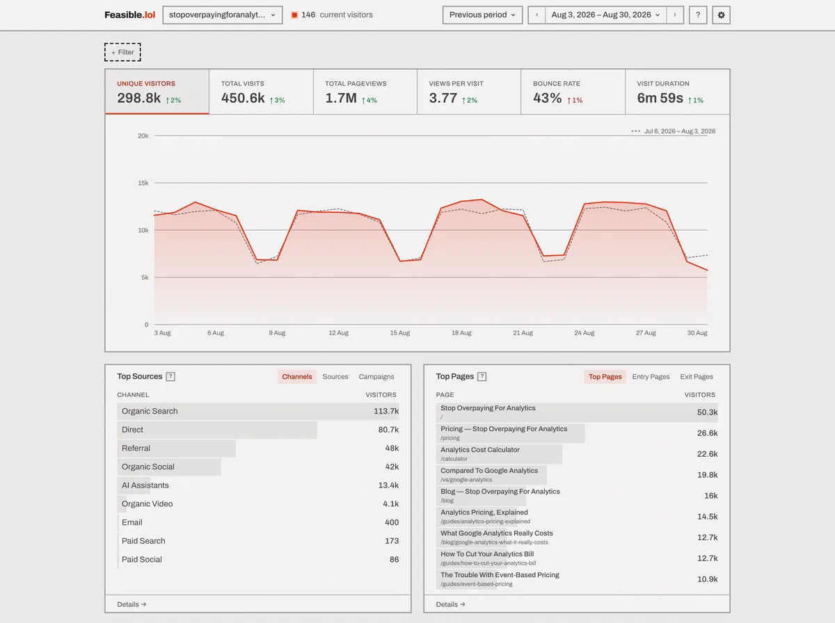
The numbers along the top
Six figures: Unique visitors, Total visits, Total pageviews, Views per visit, Bounce rate and Visit duration.
Every one of them is a button. Click it and it becomes the line on the graph.
Each one also carries its change against the comparison period. Rising isn’t always good - for bounce rate the colors are inverted, so an increase is red.
The four report cards
- Sources - Channels, Sources, and Campaigns broken down by source, medium or campaign. The campaign tabs exclude untagged traffic, so the numbers there are about campaigns rather than mostly about Direct.
- Pages - Pages, Entry Pages, Exit Pages.
- Locations - a world map, then Countries, Regions and Cities.
- Devices - Browsers and Systems, each with a version tab, Devices by type or screen size, and Languages.
There’s no Referrers card. Referrer is a filter rather than a report - pick it from + Filter when you want it.
Each card shows nine rows. Details opens a drawer with a hundred rows a page, a search box, five sortable columns - Visitors, Visits, Views, Bounce, Avg. visit - and a Break down by selector that splits any row by country, city, device, screen size, browser, operating system, language, channel or source.
The map
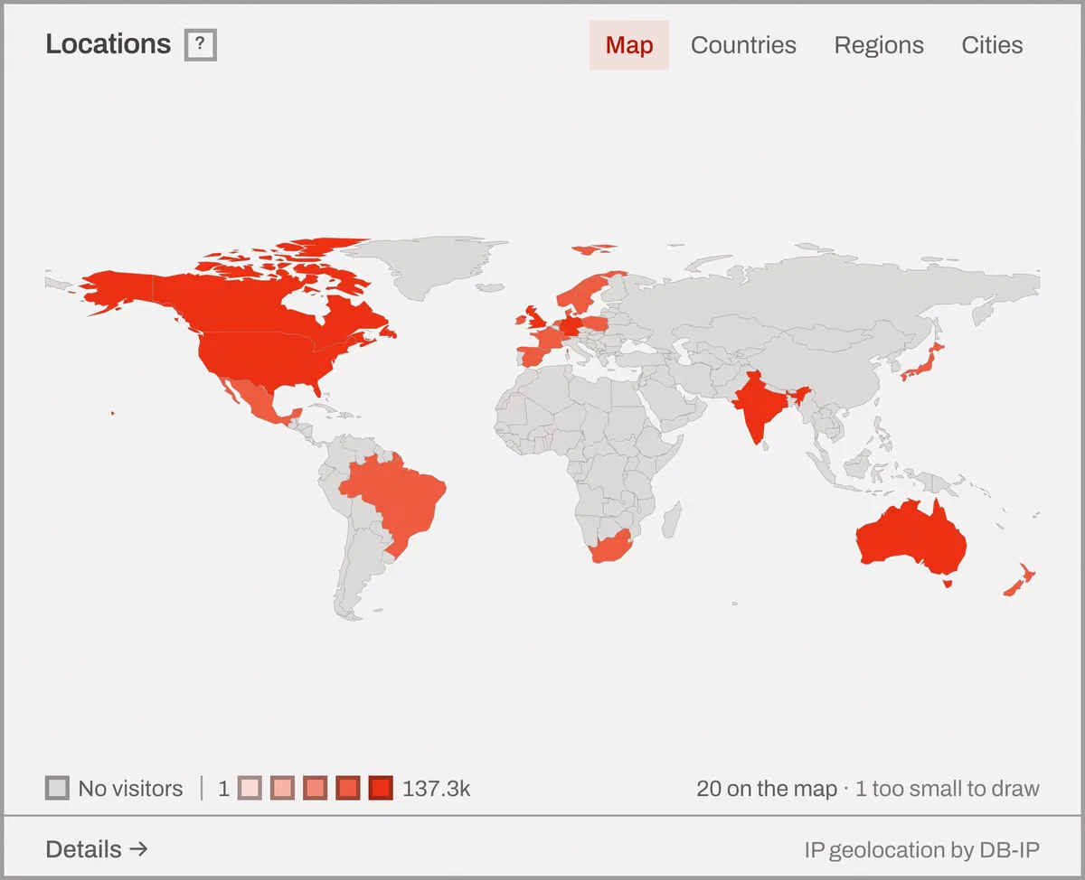
It’s drawn from country outlines compiled into the page. No mapping library, no tiles fetched from anybody, nothing that could report your visitors to a third party.
Shading is on a logarithmic scale in five steps, because country traffic is never uniform and a linear ramp paints the whole world one pale color.
A country with no visitors is drawn in a distinctly different shade from a country with one: an empty map and a quiet map have to be different pictures. Click a country to filter by it. Tab order follows traffic, so the busiest country is the first one you reach. The legend says how many countries are on the map and, when it applies, how many had traffic but are too small to draw at that scale - the Countries tab lists every one.
Filtering, and the URL
Click any row to filter by it, click it again to remove it, or use + Filter for one of six operators: is, is not, contains, does not contain, matches regex, does not match regex.
Clicking a second row of the same dimension replaces the filter rather than stacking an impossible one.
The whole state of the screen is in the URL - filters, period, comparison, which drawer is open, its page, its sort and its search. So a link you paste into a chat opens the same screen for the person who reads it, and the back button does what the back button should:
/dashboard/example.com?period=7d&f=is,country,DE&f=is,device,Mobile&details=sources:sources
Each f= is operator,dimension,value…. Repeated f= parameters AND together; several values
inside one OR together, so f=is,country,DE,FR,GB is “any of those three”. A comma inside a value is
escaped with a backslash. Up to 32 filters.
There are no saved segments. The URL is the segment - bookmark it. If you want to hand a fixed view to somebody outside your team, a shared link can be pinned to one.
Comparison
Off, Previous period, or Year over year. Previous period is the default, and it’s on unless you turn it off.
The earlier period is drawn on the same graph as a thin dashed line, matched bucket for bucket, and the legend names the exact window it resolved to. A period still running is compared against the same elapsed time - at four in the afternoon, “vs yesterday” is sixteen hours against sixteen hours.
Where the earlier value was zero, the change shows an em dash rather than a percentage. There’s no percentage increase from nothing.
Realtime
Pick Realtime, press R, or click the live pill in the top bar.
It replaces the tiles and the graph with four figures - current visitors in the last five minutes, and visitors, views and events over the last thirty - plus pageviews per minute. The report cards stay, reading the same thirty-minute window.
It refreshes every 30 seconds, and stops refreshing while the tab is in the background rather than burning your battery on a screen nobody is looking at.
“Current visitors” leaves out engagement measurements, so a single reader with a tab open doesn’t register as continuous activity.
Keyboard shortcuts
Press ? for the list. Periods first:
| D | Today | E | Yesterday |
| R | Realtime | H | Last 24 hours |
| W | Last 7 days | F | Last 28 days |
| N | Last 91 days | M | Month to date |
| P | Last month | Y | Year to date |
| L | Last 12 months | A | All time |
| C | Custom range |
And everything else:
| ← → | Previous or next period |
| X | Turn the comparison on or off |
| I | Cycle the graph’s bucket width - auto, hour, day, week, month |
| K | Jump to the first annotation on the graph |
| / | Jump to the nearest search box |
| 0 | Switch site |
| ? | This list |
| Esc | Close what’s open, or clear every filter |
Shortcuts are off while you’re typing in a field - Esc then gets you out of the field - and a key held with ⌘, Ctrl or Alt belongs to the browser rather than to us.
The arrows step the window by one of its own length, so from “Last 7 days” you walk back a week at a time. Realtime, the last 24 hours and All time can’t be stepped, because there’s no previous one.
Annotations
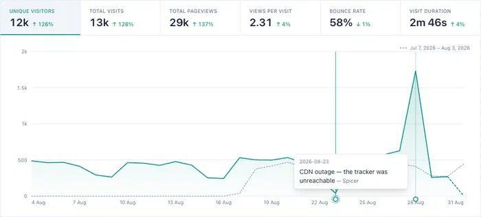
Dated notes show up as marker flags along the x-axis, so the day you changed the pricing page is on the chart rather than in somebody’s memory. Press K to jump to the first one.
They’re read-only on this screen. You write them from site settings or the API.
Language
The interface is translated, and the language is chosen in this order: a ?lang= on the URL, then
the feasible_lang cookie, then your browser’s Accept-Language header, then English. Adding
?lang=de to any URL sets the cookie, so the choice sticks. A deliberate choice beats a browser
default; that’s why the cookie outranks the header.
English is complete. German is partial. It covers the shared strings and every sign-in, account, settings and site-management screen, and it doesn’t yet cover this dashboard - so a German reader gets German account screens and an English stats screen. Fallback is per string rather than per language, which is what makes a half-finished translation worth shipping instead of hiding. German also hasn’t been reviewed by a native speaker.
There’s no language picker on a screen yet.
Settings that change what you see here
Under Settings → Sites → your site there are three screens that decide what the reports above contain: shields stop traffic being counted, path cleaning merges URLs that are really one page - retroactively - and import and export brings history in and takes everything out.
Conversions and journeys
The full-width report at the bottom holds Goals, Properties, Funnels and Explore.
Goals report conversions and revenue, Properties break registered metadata down into values, Funnels measure a configured sequence, and Explore discovers paths without a predefined sequence. See goals and funnels for the counting rules.