Feature
The one-page dashboard
Everything Feasible collects is on one page. Click any row and it filters the rest of it.
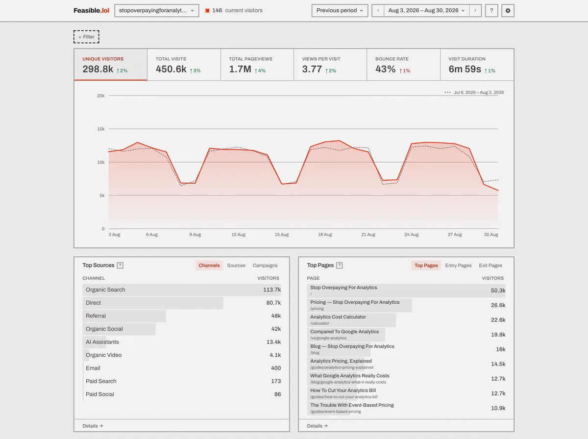
Six numbers. One graph. Five reports. Click any row to filter the page.
The six numbers
Unique visitors, total visits, total pageviews, views per visit, bounce rate, visit duration. In that order, always.
Click a tile to graph it. Press I to switch between hourly, daily, weekly, and
monthly views. A period with no data shows a gap, not a false zero.
Compare against the previous period or last year. Change markers appear on all six tiles.
Five cards
Sources - channels, sources, and UTM campaigns.
Pages - pages with their titles on a companion line, entry pages, exit pages.
Locations - a map, countries, regions, and cities.
Devices - browsers and versions, operating systems and versions, device types and screen sizes, plus languages.
Behavior - four tabs for goals, custom properties, funnels, and page paths.
Click “Details” for 100 rows, search, sorting, and breakdowns.
Filters live in the URL
Six operators: is, is not, contains, does not contain, matches regex, does not match regex. Repeated filters AND together, several values inside one filter OR.
Filters stay in the URL. Share the link and someone else sees the same report. Press Escape to clear them.
The date menu has 13 ranges. Keyboard shortcuts switch dates, sites, and search.
Realtime shows current visitors plus traffic from the last 30 minutes. It refreshes every 30 seconds.
Why it’s fixed
A dashboard you must assemble is unfinished software. Feasible uses the same layout for every account, public dashboard, and embedded report. Bots are out by default. Imported history is already included. You don’t have to find either setting.
More in the docs, and the numbers themselves are defined in metric definitions.
Rather see it than read about it? The live demo is a real dashboard with real traffic on it. No signup, no login.
The trade-off
You can’t rearrange it. There’s no widget grid, no saved layouts and no custom-metric builder - every account sees the same dashboard. Scroll depth, time on page, exit rate and the revenue metrics never appear in the tiles or the drawer’s columns either; they’re in the query engine and the API instead.